一戊珠宝
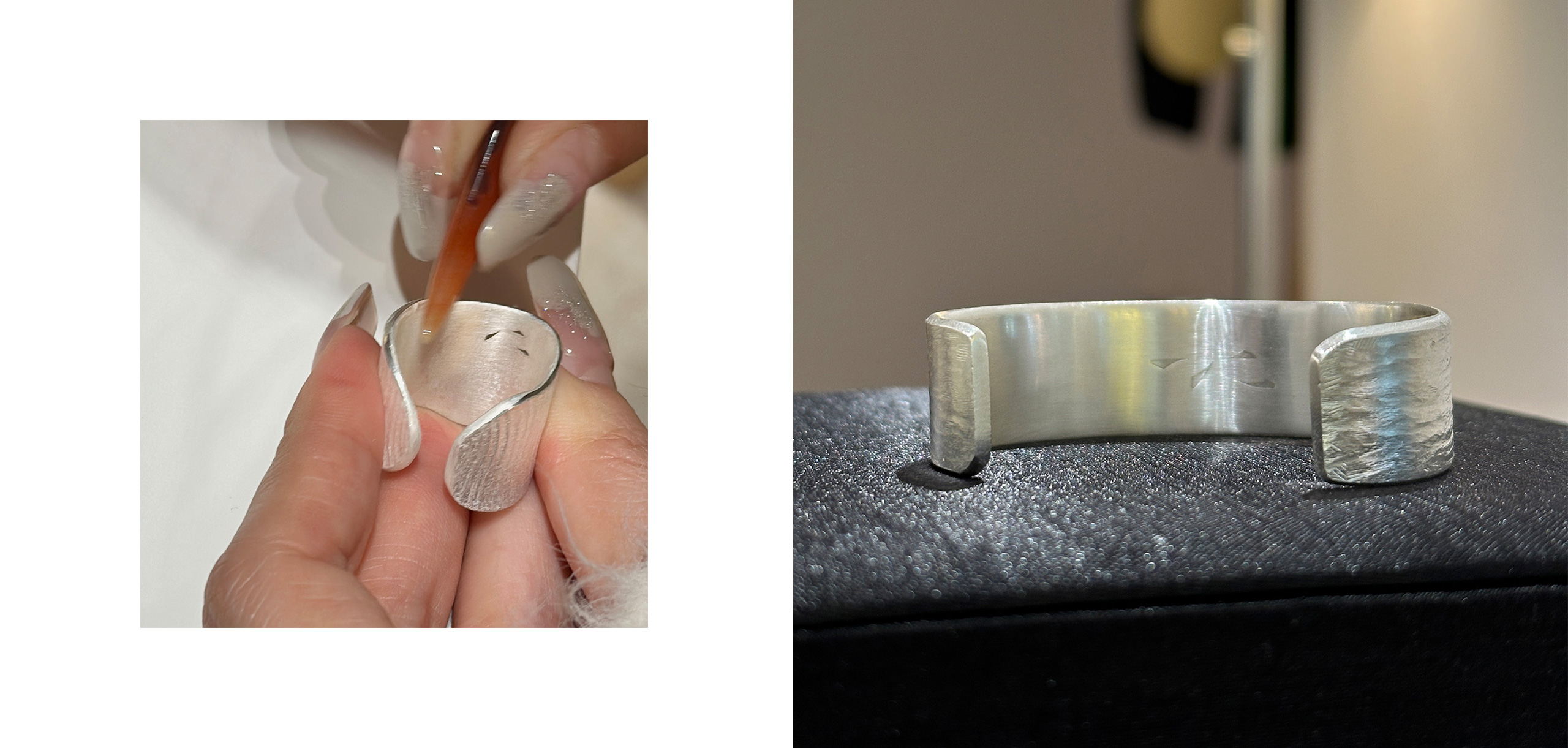
The brand "一戊", pronounced as "Yi Wu", is an independent designer jewelry brand born in Nanjing, China. "Wu (戊)," meaning "object" in Chinese, is homophonic and concentric, where each object has its unique sentiment. With their creations, the brand aims to encounter that special someone among the millions, guarding them for a lifetime, as good design is not just for a moment.
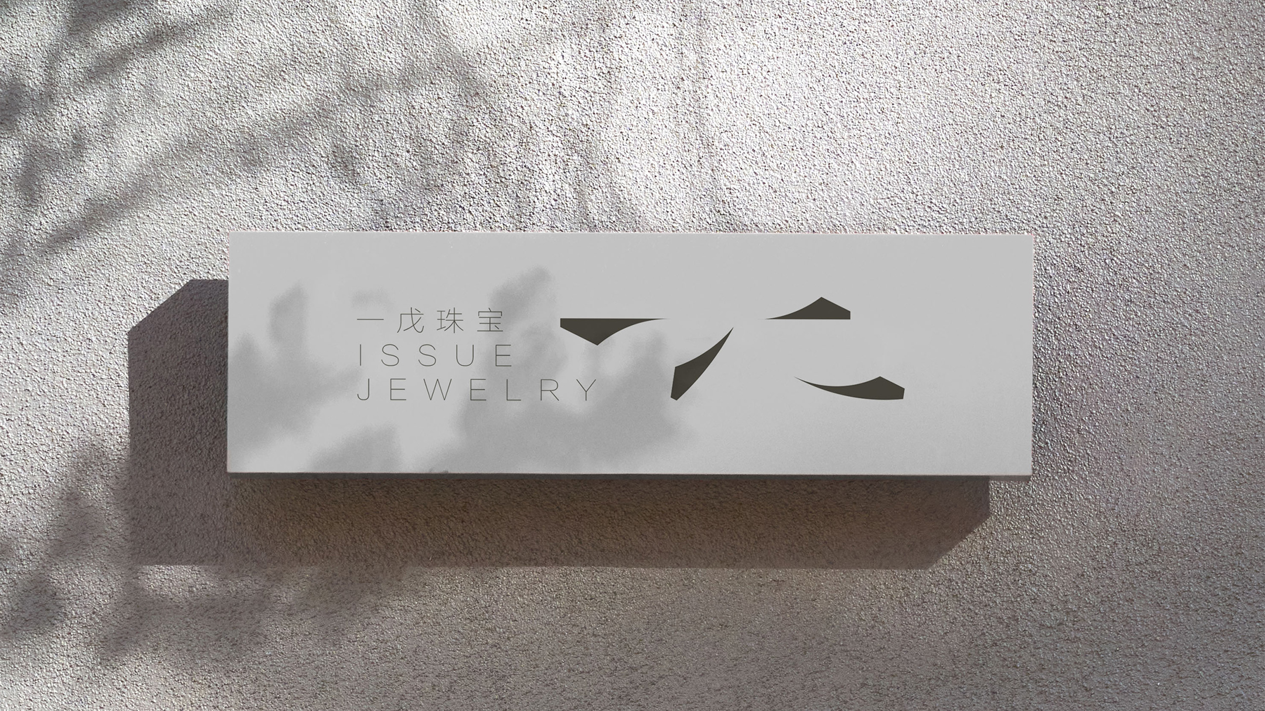
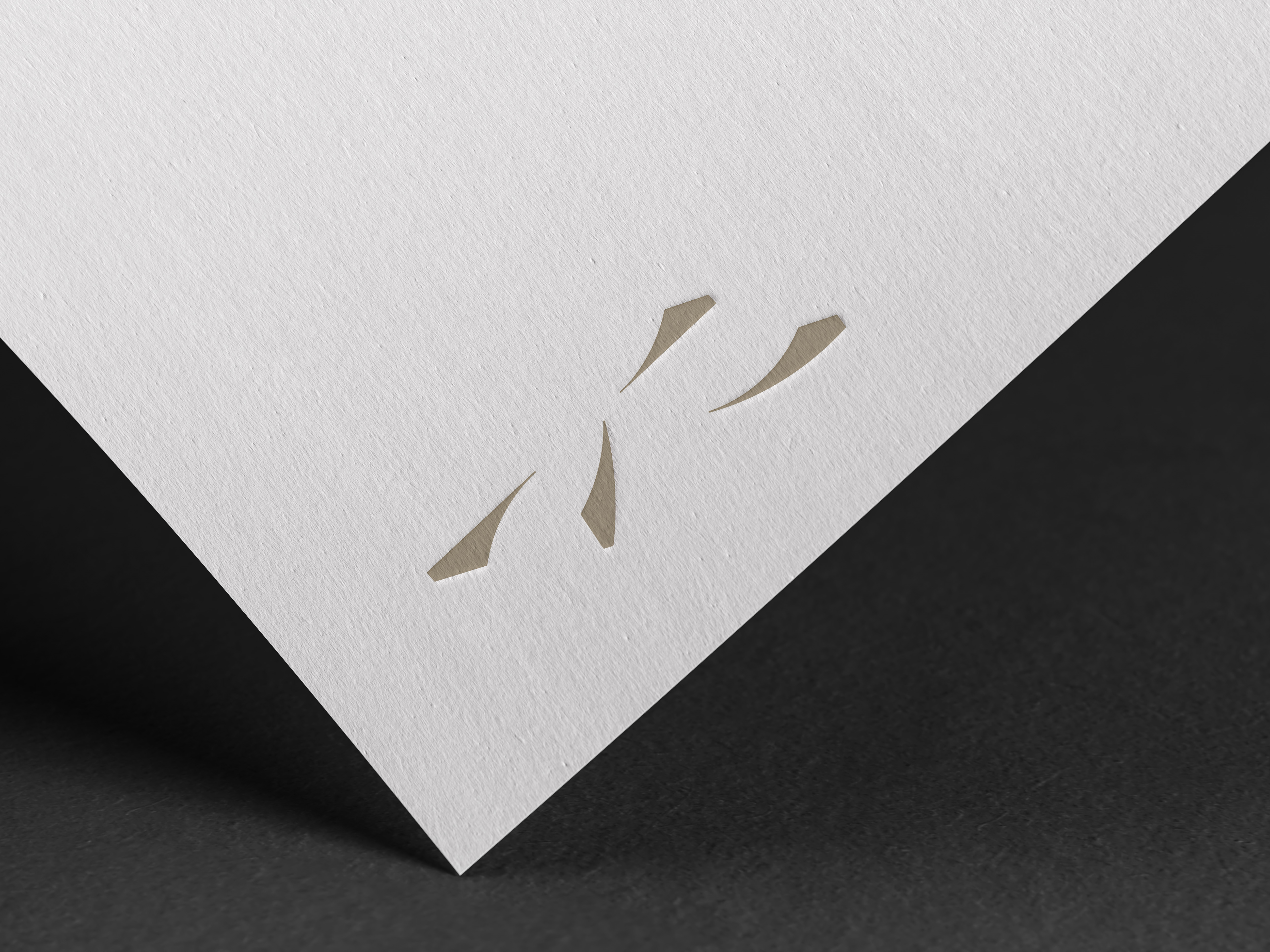
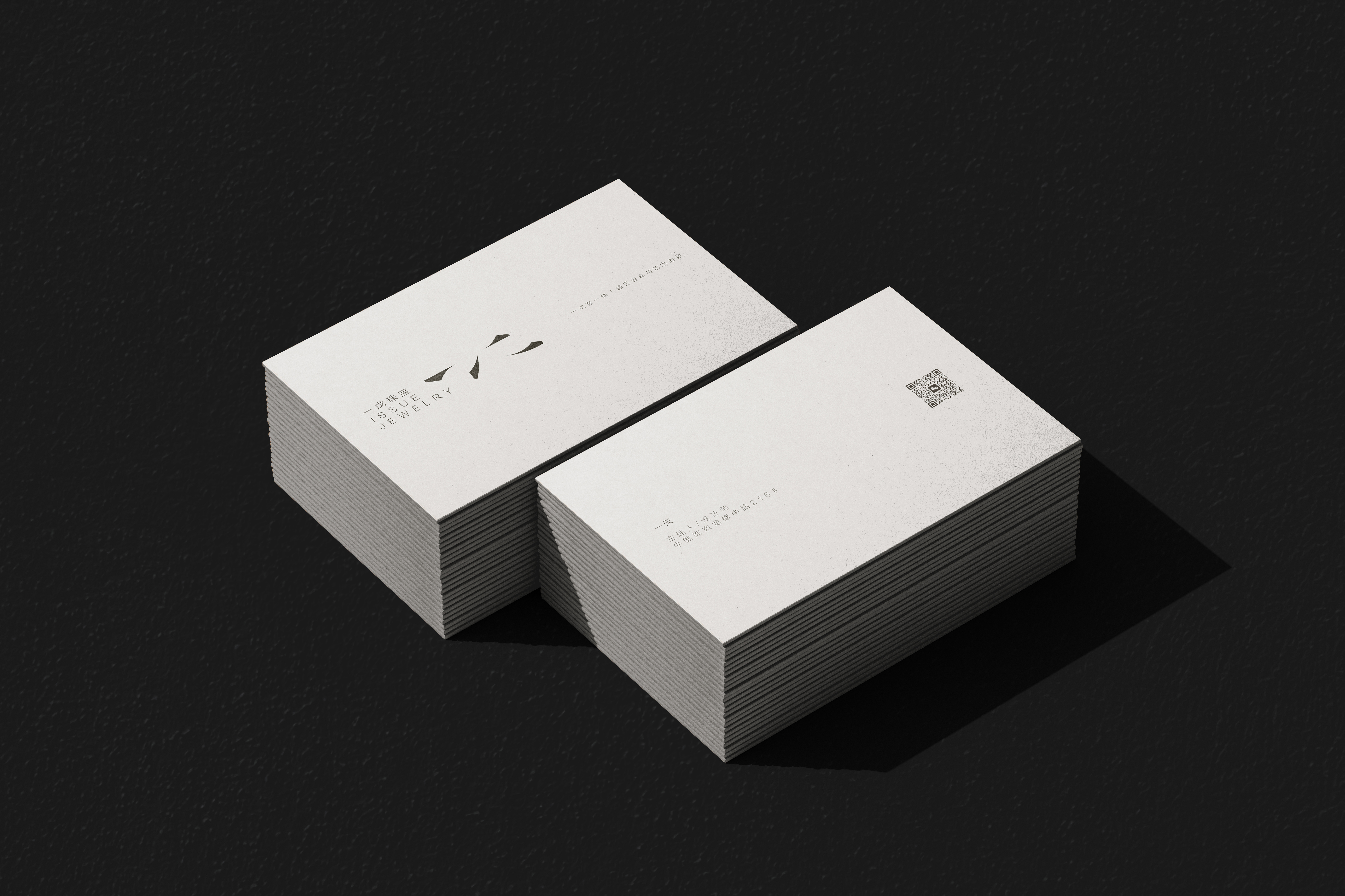
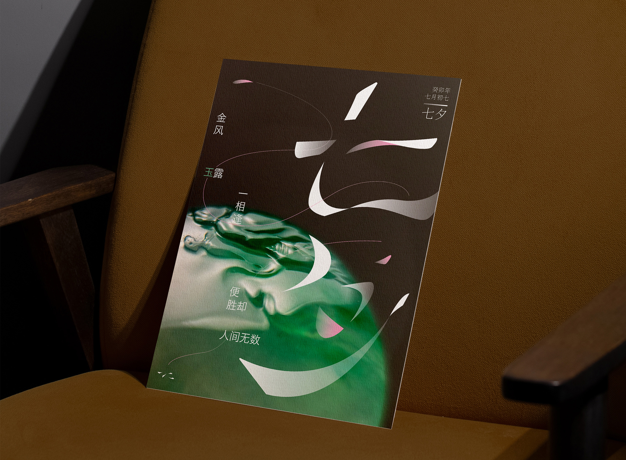
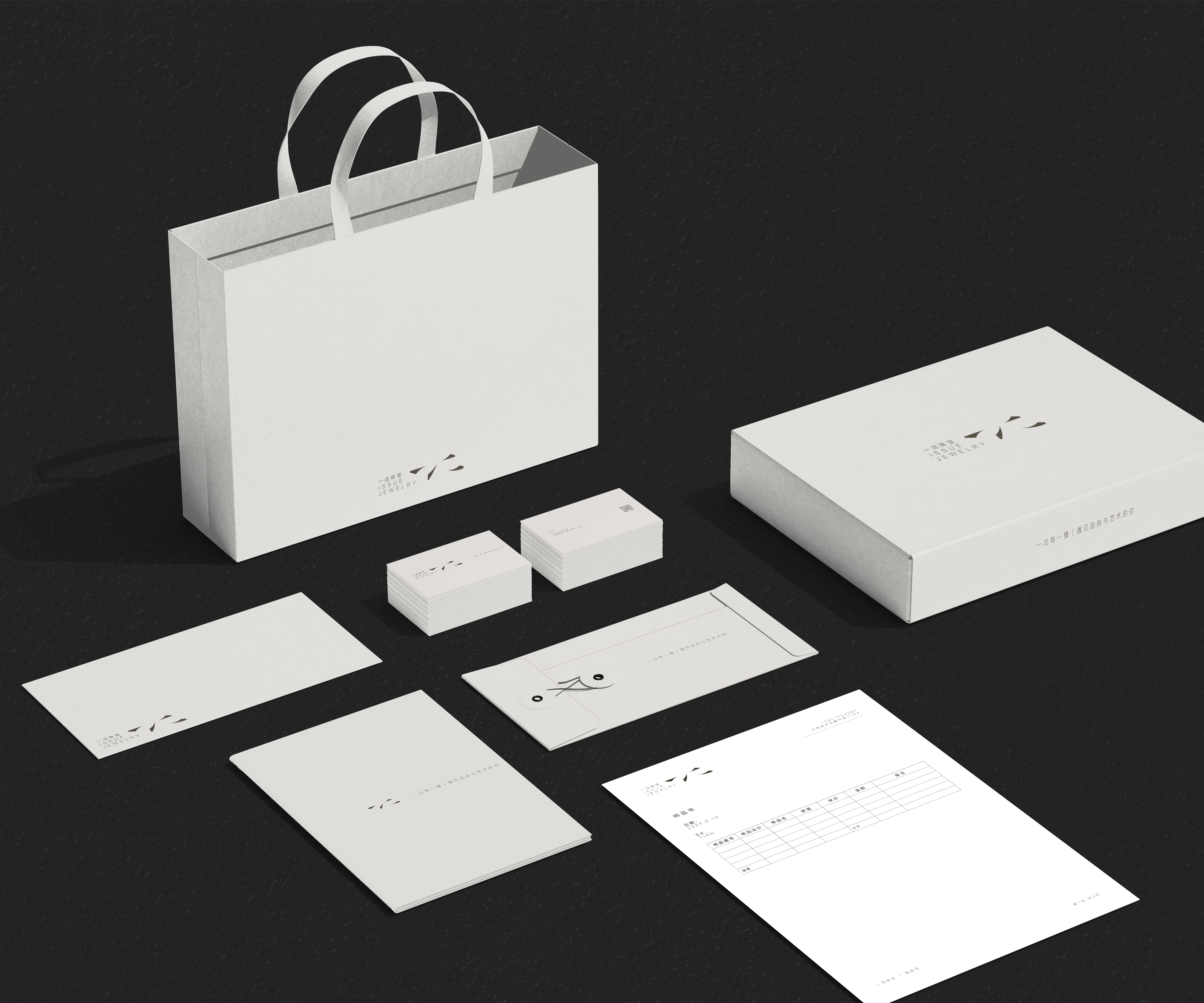
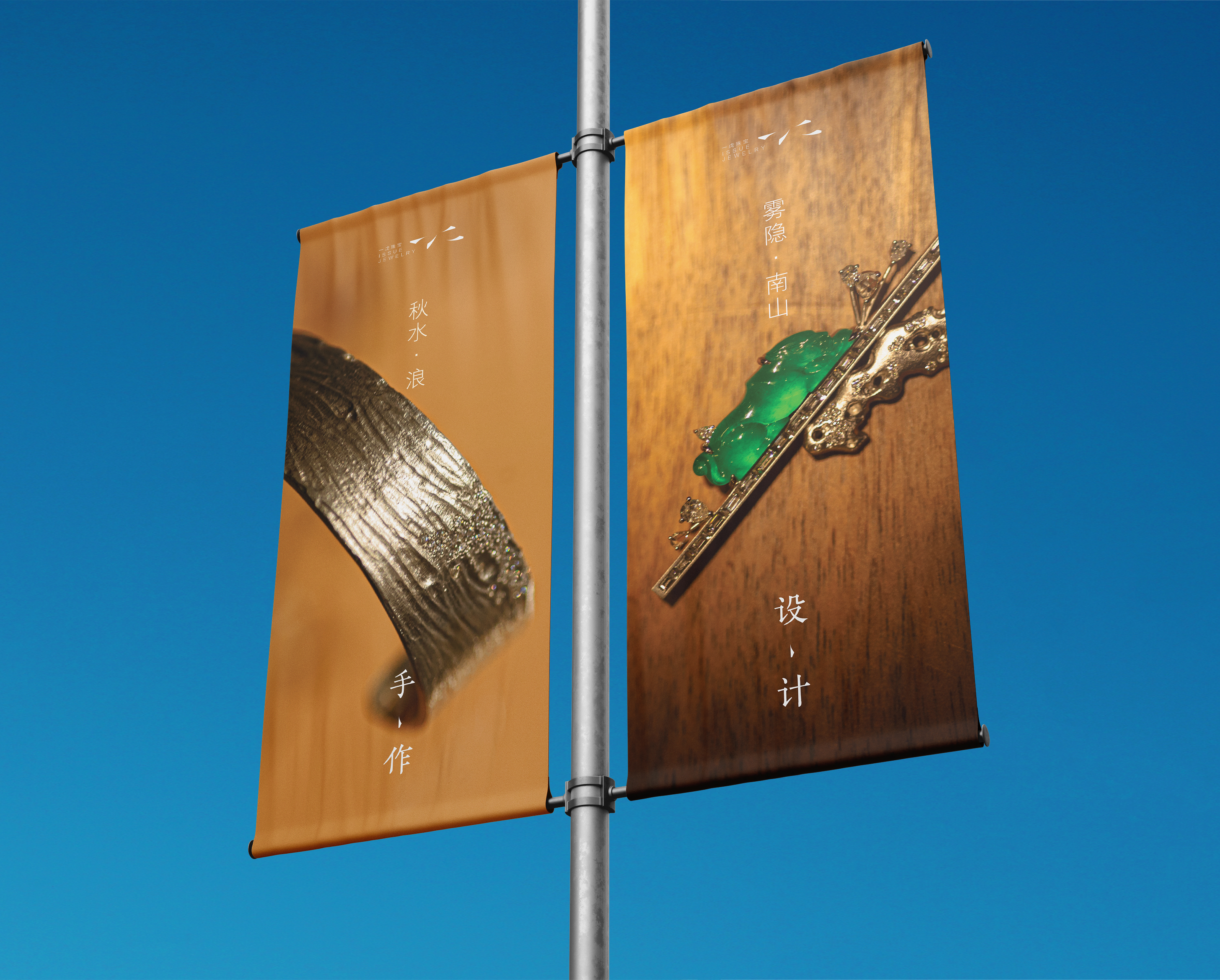
I have known this brand for a long time and have been friends with the designer for many years. Since its inception, she finally accepted my suggestion to design a logo. Understanding her dedication to jewelry, admiration for traditional Chinese calligraphy and painting, and insistence on details, I delved into the structural framework and stroke style of the characters "一戊" in traditional calligraphy. Retaining the stroke characteristics of regular script and running script and combining them with a modern and concise design philosophy, I created the complete characters of "一戊." Given the designer's poetic rather than straightforward style in her works, I aimed for the brand logo to be playful. I omitted finer strokes from the original draft, retaining only the distinctive starting and ending shapes. The logo appears like a softly blooming flower or a gemstone with multiple facets, evoking a delicate yet solid impression. However, since the character structure adheres to the traditional framework, upon closer inspection, users will realize that it embodies "一戊."
I have known this brand for a long time and have been friends with the designer for many years. Since its inception, she finally accepted my suggestion to design a logo. Understanding her dedication to jewelry, admiration for traditional Chinese calligraphy and painting, and insistence on details, I delved into the structural framework and stroke style of the characters "一戊" in traditional calligraphy. Retaining the stroke characteristics of regular script and running script and combining them with a modern and concise design philosophy, I created the complete characters of "一戊." Given the designer's poetic rather than straightforward style in her works, I aimed for the brand logo to be playful. I omitted finer strokes from the original draft, retaining only the distinctive starting and ending shapes. The logo appears like a softly blooming flower or a gemstone with multiple facets, evoking a delicate yet solid impression. However, since the character structure adheres to the traditional framework, upon closer inspection, users will realize that it embodies "一戊."
